
Service Studio 8.0 Help
Insert Columns in Rows
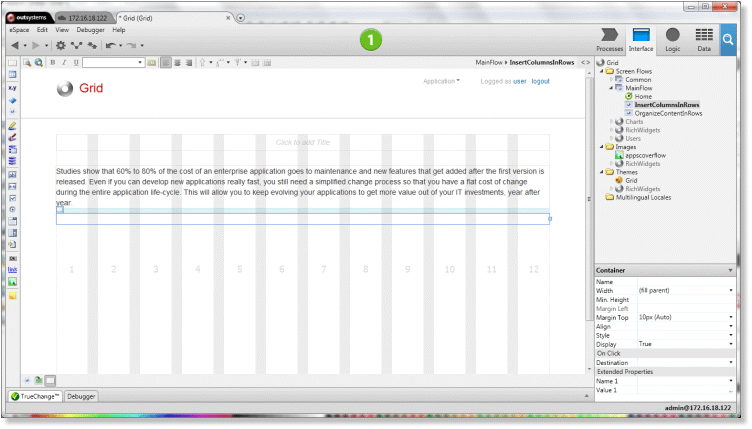
The example above requires three  Containers, one for each row:
First Row: the text from end to end, i.e., one part;
Second Row: the image and text, i.e., two parts;
Third Row: the two images with text next to them, i.e., four parts.
To design this example, start by adding a container that fills the entire row and type the text in.

Now, let's add the row that is divided into two parts:
Add a container that fills the entire row below the first container;
Inside the container of the second row, add a container of six-column width and put the image inside;

Again, inside the container of the second row, add a second container and type the text in.

For the third row repeat the previous procedure, adding the following containers and content:
Add a container with two columns of width and put the image inside;
Add a container with four columns of width and type the text in;
Add a container with two columns of width and put the image inside;
Add a container with four columns of width and type the text in;

That's it! Test and resize the browser to check out whether the parts of the rows remain in the same row or wrap to the row below.
For the final make up, simply format the content of the containers by applying styles you define in style sheets.
Video Recording
To see how the above steps were performed in Service Studio watch the video below.
See Also