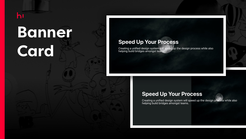
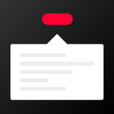
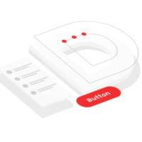
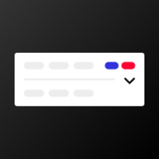
Hi Components Library

Hi Components Library

All Industries | Development Tools

Solution Overview

A solution for your apps development in a library of multiple different components ready to be used.
View Demo

Key Features

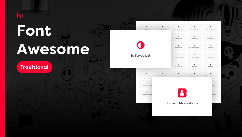
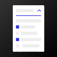
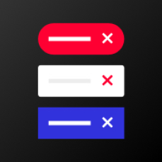
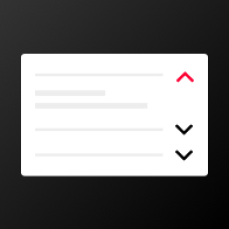
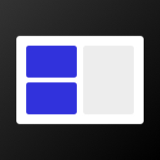
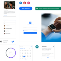
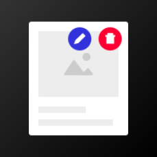
Different components available, to help you in different situations or open more opportunities in your applications development.

Check the available components list and their description:

  • Hi Actions Container (R) 
    Display large amounts of content with the possibility to include actions in it.
  • Hi Actions Container (T) 
    Display large amounts of content with the possibility to include actions in it.
  • Hi Advanced File Upload (R)
    Component used to insert or drag and drop a file.
  • Hi Advanced Info Overlay (R)
    Full card overlay for additional content on the entire card.
  • Hi Advanced Search (R)
    Allow the user to have multiple types of search inputs.
  • Hi Advanced Search (T)
    Allow the user to have multiple types of search inputs.
  • Hi Advanced Timeline (R)
    Have a timeline displayed vertically and with several options to show in how to have content displayed or hidden.
  • Hi Arc Chart (T)
    Allow you to use a list of arc-chart type to create a chart.
  • Hi Auto-Resize Text Area (R)
    Component to make the Text Area to expand when content is added.
  • Hi Auto-Resize Text Area (T)
    Component to make the Text Area to expand when content is added.
  • Hi Body Class (R) 
    Use it to insert classes on the html body (Add, Remove and Toggle actions).
  • Hi Bulk Select (T)
    Use it to select/unselect all checkboxes inside a Table Records widget.
  • Hi Button Option (R)
    Display one or more options inside a button.
  • Hi Card Center Row Content (T)
    Show content in the center row, plus the choice of having other content or actions in the left and/or right side of the card.
  • Hi Card Swiper (R) 
    Component with a slideshow card swiper and 3D effect.
  • Hi Card With Progress (R) 
    Have a card with different text placeholders and a progress bar.
  • Hi Circular Slider (T)
    Create a circular slider by giving a list of items and an initial value for the slider.
  • Hi Color Preview (R) 
    Have a container that changes its background color.
  • Hi Color Preview (T) 
    Have a container that changes its background color.
  • Hi Confetti (R) 
    Component to drop confetti on your screen.
  • Hi Confirmation Delete (R) 
    Have a confirmation step that can be used to verify danger actions, like delete or other type of exclude data.
  • Hi Confirmation Delete (T) 
    Have a confirmation step that can be used to verify danger actions, like delete or other type of exclude data.
  • Hi Content Flow Steps (T) 
    Component used to display content in a step way and to create a flow of steps.
  • Hi Copy to Clipboard (R) 
    Component used to copy and or cut text to clipboard.
  • Hi Country Code (T)
    Have a dropdown with a flag and international country code to be selected.
  • Hi Credit Card (R)
    Show a card with information such as number or name of the holder and have the option to change the card's background image.
  • Hi Credit Card (T)
    Show a card with information such as number or name of the holder and have the option to change the card's background image.
  • Hi Cupertino Pane (R)
    Slide-over pane with touch technologies.
  • Hi Custom Button Loading (R)
    Button with a loading state.
  • Hi Custom Dropdown Search (R)
    Enhanced dropdown block, with a search functionality.
  • Hi Custom Popover (R)
    Display additional content on user selection.
  • Hi Custom Section Index (R)
    Use it to enable the users to navigate within a page quickly.
  • Hi Dropdown Search Inline (R)
    Display a dropdown with a search functionality.
  • Hi Element Scroll (T)
    Component used to create a vertical scroll for content.
  • Hi Error Screen (R) 
    Display on the screen the type of a page error.
  • Hi Error Screen (T) 
    Display on the screen the type of a page error.
  • Hi Expandable Table Row (R) 
    Expand and collapse a row with content between table rows.
  • Hi Flex (R)
    The Flexible Box Layout Module makes it easier to display flexible and responsive elements without using float or positioning.
  • Hi Font Awesome Free (T)
    Use it to preview and insert the attributes of Font Awesome Free icons.
  • Hi Font Awesome Icon (R)
    Use it to preview or insert a Font Awesome icon.
  • Hi Font Awesome Icon (T) 
    Use it to preview or insert a Font Awesome icon in Traditional applications.
  • Hi Full Page Overlay (R) 
    Have a full page overlay for additional content on the entire screen.
  • Hi HTML Editor (R) 
    Next generation block styled editor.
  • Hi Icon SVG (R) 
    Display and create icons SVG from HTML tags.
  • Hi Iframe (R) 
    Display the content of an URL.
  • Hi Image Background (R)
    Have a banner with custom content. Areas without content or having images without background will have a filled background with a color of your choice.
  • Hi Image Cropper (R) 
    Component that gives the user a selection of image cropping possibilities.
  • Hi Increment Input (R) 
    Input with actions to change the numeric value (- 1), (+ 1) or in a different interval.
  • Hi Increment Input (T) 
    Input with actions to change the numeric value (- 1), (+ 1) or in a different interval.
  • Hi Input Code (R)
    Have a styled input that can force number or password type.
  • Hi Input Code (T)
    Have a styled input that can force number or password type.
  • Hi Input Color (R) 
    Have an input color type, where the user can insert different color type codes.
  • Hi Input Color (T) 
    Have an input color type, where the user can insert different color type codes.
  • Hi Input Label (R) 
    Display a label and its widget.
  • Hi Input Label (T) 
    Display a label and its widget.
  • Hi Input Mask Currency (R)
    Apply a mask on currency input fields.
  • Hi Input Month/Year Mask (R)
    Applies a mask to the input with a format MM/YYYY.
  • Hi Input Month/Year Mask (T)
    Applies a mask to the input with a format MM/YYYY.
  • Hi Input Progress (R)
    Component to display an input progress regarding its expected value length.
  • Hi Loading Animation (R)
    Component to display a loading state.
  • Hi Loading Animation (T)
    Component to display a loading state.
  • Hi Loading for Splash Screen (R)
    Splash loading component is used to do the splash screen when you start or open your application.
  • Hi Masonry Gallery (R)
    Display content in a masonry like pattern.
  • Hi Multi Detail Card (R)
    Display different information type in a card with several content areas.
  • Hi Multi Select Dropdown (R)
    Have a dropdown with a multiple choices selection from several options.
  • Hi Multi Select Dropdown (T)
    Have a dropdown with a multiple choices selection from several options.
  • Hi Multiple Detail Card (R)
    Use it to display as many info in your card as you want.
  • Hi Native Range Slider (R)
    The input type "range" defines a control for entering a number whose exact value is not important (like a slider control).
  • Hi Notifications Popover (R)
    A popover to display notifications.
  • Hi Offset Menu (R)
    Use the Hi Offset Menu to add a different menu to your app.
  • Hi Opacity Effect (R)
    Component to add an opacity effect to all its content.
  • Hi Opacity Effect (T)
    Component to add an opacity effect to all its content.
  • Hi Pagination Show Items (R)
    Help users to find a specific listed item by having a different number of items per page choice to select.
  • Hi Parallax Mouse (R)
    Component that allows to add items that move at a different speed depending on the mouse movement.
  • Hi Parallax Scroll (R)
    Component that allows you to add items that move at a different speed depending on the scroll.
  • Hi Popover Filter (T)
    Component having a popover that can be used to display a filter triggered by clicking on a button included in the component.
  • Hi Popup Structure (R)
    Use this to have display a popup having a title, a secondary content (like for example, a checkbox) and an actions area at the bottom.
  • Hi Progress Scroll (R)
    Hi ProgressScroll is a minimalist page scroll indicator to visualize the scroll position (how much the user has scrolled) in a slim progress bar. Fully customizable via CSS.
  • Hi QR Coder (R)
    A simple QR Code generator to your application.
  • Hi Remove Tag (R)
    Use it to select and remove tags.
  • Hi Responsive Breadcrumbs (R)
    Display the current user location in applications with a deep page hierarchy.
  • Hi Ring Progress (R)
    Component to display an element surrounded by a ring with a progress.
  • Hi Ring Progress (T)
    Component to display an element surrounded by a ring with a progress.
  • Hi Section Actions (R)
    Use it to separate content and you can include in it actions.
  • Hi Section Content Expandable (R)
    Useful component to organize information by displaying part of the content first and then expand it to see more.
  • Hi Select Card (R)
    Allow the user to select cards between multiple options.
  • Hi Select Card (T)
    Allow the user to select cards between multiple options.
  • Hi Responsive Breadcrumbs (T)
    Display the current user location in applications with a deep page hierarchy.
  • Hi Select Option Group (T)
    Use it in a dropdown so you can select an option with options separated by groups.
  • Hi Select Tag (R)
    Component to select multiple options displayed as tag elements.
  • Hi Side Actions (R)
    Have a button icon with an action that when pressed, floats additional actions to a different choice of positions.
  • Hi Simple Pagination (R)
    Display the pagination in a different layout for its options and results.
  • Hi Sticky Content (T)
    Component to add a bottom area on your screen used to compare items.
  • Hi Swipe Up Card (R)
    Swipe up a card in you mobile app.
  • Hi Table Edit Inline (R)
    Allow the user to easily edit, add or delete content inline on a table.
  • Hi Table Row Expandable (R)
    Allow the user to create and display expandable content inside the table.
  • Hi Table Row Expandable (T)
    Allow the user to create and display expandable content inside the table.
  • Hi Timer Carousel (R)
    Have a carousel with multiple items and a visible timer in an horizontal slide.
  • Hi Title Line Separator (R)
    Use this to show a text with separator, so it helps you to organise and structure better your content.
  • Hi Tooltip Container (R)
    Display a tooltip on a card, input or other pattern type.
  • Hi Transfer List (R)
    Component with a double column transfer choice box which allows the user to move a single or multiple items between two select items.
  • Hi Two Columns Same Height (T)
    Display columns with the same height. You can also set different widths for the first column and different gap sizes.
  • Hi UI Range Slider (T)
    Allow the user to select a single value between two range values.
  • Hi Undo Action (R)
    Undo Action causes an action to be "triggered" just after a few seconds, giving the user an opportunity to cancel that selected action.
  • Hi Upload File Size (R)
    Actions to return a file size in bytes that allows you to validate a certain file size uploaded through the uploaded widget before send it to the server.
  • Hi User Info Popover (R)
    Have a popover to display the user info.
  • Hi Users List (R)
    Have the option to reverse a previous action.
  • Hi Users List (T)
    Have the option to reverse a previous action.
  • Hi Visibility (R)
    Component to toggle an element visibility. Hidden elements take up space on your screen.
  • Hi Zip Code Mask (R)
    Insert a zip code number and it will be inserted dynamically by having its first and second part separated.

(R) Reactive component
(T) Traditional component

hi_actions_container
hi_advanced_search
hi_arcgraph
hi_banner_card
hi_body_class
hi_bulk_select
hi_card_center_row_content
hi_card_with_progress
hi_circular_slider
hi_color_preview
hi_confirmation_delete
hi_country_code
hi_credit_card
hi_custom_carousel
hi_custom_popover
hi_custom_section
hi_custom_sectionindex
hi_error_page_image
hi_font_awesome_free
hi_font_awesome_icon
hi_font_awesome_traditional
hi_icon_svg
hi_iframe
hi_input_color
hi_input_label
hi_input_mask_currency
hi_input_tooltip
hi_large_input
hi_multi_select_dropdown
hi_multiple_detailcard
hi_number_input
hi_popup_structure
hi_remove_tag
hi_responsive_breadcrums
hi_select_option_group
hi_select_search
hi_swipe_up_card
hi_table_expandable
hi_table_records_expandable
hi_two_columns_same_height
hi_users_list
hi_zip_code_mask

Key Benefits

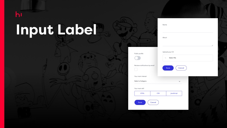
Speed up the development time for your apps by finding here solutions to increase their quality and range of available features.

Integrate these components in your apps and use their customisation options.

Other Solutions from Hi Interactive

Hi Banner Card
Hi Banner Card
Component with a banner custom content. The Banner's area without images, or having images without background will have a filled background with a color of your choice.
See Solution Details
Hi Card Center Row Content
Component used to show content in the center row plus the choice of having other content or actions in the left and/or right side of the card.
See Solution Details
Hi Custom Breadcrumbs
Component to display the current user location in applications with a deep page hierarchy.
See Solution Details
Hi Custom Popover
Hi Custom Popover
Components to display additional content on user selection.
See Solution Details
Hi Custom Section
Hi Custom Section
Component that separates content and that can include actions.
See Solution Details
Hi Custom Section Index
Component to enable the users to navigate within a page quickly.
See Solution Details
Hi Multi Select Dropdown
Component to select multiple choices from several options.
See Solution Details
UX/UI Services
UX/UI Services
Creating a delightful experience for the user is a balanced act between usability, interface design, and technology. With a Design Thinking approach, we’re able to build digital products addressing both the business and user needs fostering the best digital experiences for your customers.
See Solution Details
Hi Table Records Expandable
Component to allow the user to create and display expandable content inside the table.
See Solution Details
Hi Two Columns Same Height
Component to display columns with the same height. You can also set different widths for the first column and different gap sizes.
See Solution Details
Front-End Expert Services
We share our know-how and we work hand-in-hand with your in-house team to optimize the Front-End of your OutSystems applications while reducing development and maintenance costs.
See Solution Details
Design System
Design System
The Design System reduces the time to market of your applications, eliminating redundant design and code tasks. It’s unique architecture scales operations, fostering assets re-use and ensuring brand consistency at scale.
See Solution Details
Front-end consultancy
It accompanies the client in decision-making, foreseeing development impacts, and promotes the maximum use of the platform's benefits.
See Solution Details
Assessment
Assessment
The assessment of your factory will help you understand: - The state of the applications; - How the applications are developed in terms of UI; - What UI frameworks are being used; - How many components exist and if they are reused.
See Solution Details
Highlight - Design System Manager
The tool to centrally document your company's Design System. It centralizes information so designers and developers have a common space to have all assets. It offers multiple technical features, from the definition of the branding to the interface rules for different themes, such as the ability to share and document components of different technologies
See Solution Details
Hi Advanced Search
Hi Advanced Search
Component to allow the user to use multiple types of search inputs.
See Solution Details
Hi Actions Container
Component that can deliver large amounts of content with the possibility to include actions.
See Solution Details