Going for the Clickable Prototype:
Getting the Wow With Hi-Fi
Being a user interface (UI) designer is a cool job. I really like it. It feels good to spend my days designing UIs that capture the attention of the users. But I still get, from time to time, the “now you just have to make it pretty” type of attitude from the “instant gratification” crowd who want everything now.
The thing is, UI design or Hi-Fi, is a crucial factor in every prototyping process. You can have the best research with all the use cases well defined, all the user flows, and the low-fidelity mockups for every scenario that you defined, but it’s when you get into UI design that the game changes. It’s these Hi-Fi mockups that are the piece of pie (or pizza!) that catch all the user attention make them react, positively or negatively to an app.
And that’s why this is not just about making it pretty. You’re defining the customer style, and you are creating the way the user will interact with the brand. This must have a direct impact on your design. Many times, it’s here that you’ll understand if an app will make or break. Not only for your customer’s stakeholders but also, and more importantly, for the app users.
So how can you create a UI that is not only great looking but it also delivers the user experience that will make a successful adoption?
How to Start
The beginning of every prototype requires an ideation part. It’s here that you feed your brain with references and context about the project, the customer, the customer’s brand, and the users.
To get references, I usually linger through websites like Dribbble or Behance for some inspiration. I also do some research and see what the others are doing. And I take a look at the top applications in the stores because those are probably the ones that are most familiar and comfortable to your users.
Now that I have some references to help, it’s time to gather context on the app. I typically approach the app stakeholders to get qualified answers to the following questions:
- Is this a web, responsive, or mobile App?
- If it is mobile, is this iOS, Android or hybrid?
- Who is going to use the app?
- Under what conditions is the app going to be used?
With all the necessary context provided by the stakeholders, it’s time to care about the brand.
Before starting any design, you will need to understand how the brand should be positioned. For this, you have a brand book to follow with usage rules for the typography, colors, and imagery. I recommend that you also use your customer’s website extensively as a reference; it’s an excellent way to see how they are speaking their own language.
Keep in mind that is of extreme importance that you know how the brand communicates. You are the one putting the brand available to the public, and you need to make the users feel at home.
It’s at this moment that we are almost ready to go. It’s time to gather all this data and take a look at all existing Lo-Fi mockups and learn the flow and interaction points that will make your app a success. You just have to create a new Sketch document and do your magic.

Let’s Get to Work!
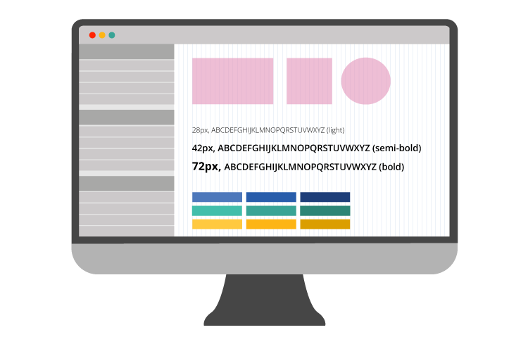
To start, I usually pick the two screens that I consider to have a richer visual to define the base of the UI. It can be the dashboard, a detail page or any other page as long as it’s rich in visual elements. It’s from here that you will grow the style of your app.
This is typically the slowest part of the process. It’s the trial-and-error part, where you need to apply the brand colors and test them together to see if they work for you. It’s also the best part of it. It’s in this stage that things come to life, and you get to have that really satisfying feeling of having a new, beautiful app appear before your eyes.
Now that you have a solution for the design, then it’s a matter of following the Lo-Fi mockup flows, grab any assets you created on Sketch, and use your creativity to build the all other screens for the app.
Speeding Up the Design Process
An excellent way to speed things up is to have a library of UI Patterns that are so common that you can reuse and recreate them easily. Also, keep a good set of images and dummy data that you can use whenever needed.
At OutSystems, we have our own framework, OutSystems UI. It was created to help developers build UI faster, by using the most common patterns and templates and giving the possibility of customization. So, every time we design something, we need to have the framework in mind, understand the patterns, and know the themes and how to extend the patterns in our UI design.
By using this approach, the relationship between developer and designer is going to be very smooth and profitable for both. Why? Everyone is working with the same mindset, reducing the misalignment between teams, and eliminating that sense of having to do the same things all over again in every new project. So, create symbols for the UI patterns that you are going to repeat throughout your prototype and develop styles for your headings, text styles, and colors in your Sketch file. Now you’ll be able to make changes to your design easily and apply them to all screens in the prototype.
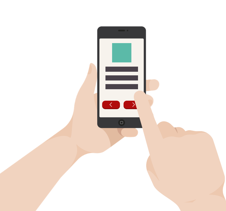
Taking It Live
When you get to the point where all your Hi-Fi mockups are ready, and you are happy with them, you can upload them to a tool that allows you to share the link with your customer and create a clickable prototype.
To create prototypes, we use InVision, because it integrates with Craft, a Sketch plugin that allows us to upload directly from Sketch to InVision. We can not only create the prototype, but we can also share the project with a developer. The developer can access the CSS code or share the work with our stakeholders and receive comments directly in the tool.
But, more than the tools you use, what’s really important is that you have a beautiful, fully clickable prototype that you can share with your customer that creates the “Wow” reaction. Something that some days ago was just an idea is now alive and kicking.
Famous Last Words
UI design is not an exact science; there are no better or worse ways to achieve a good result. If you are a designer, you have tech skills and experience, but you always need to be willing to learn other ways to do the same thing or even from people who don’t design.
Also, it’s important to understand that this is not a vanity activity. Yes, you are working on the look and feel of something. You are effectively making it prettier, but even so, it should never be for the sake of being cute; an attractive look and feel increases adoption rates. People tend to like beautiful stuff; just make sure that you deliver the prettiness with the substance of a really well-thought-out user experience, and you will be much closer to success.
