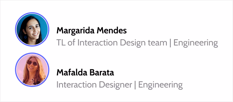
By Margarida Mendes and Mafalda Barata.
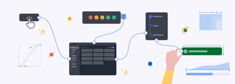
We are the Interaction Design Team (IxD), a small group dedicated to elevating the standard experience of OutSystems products.
Working together with the Design System team and our UX/UI Designers in Engineering, our focus is to bring motion design, interaction patterns, research and prototyping to the table, to enrich the user experience as a whole.
The origin story
Our team came to be as our goals became more ambitious, and a new design system started taking shape.
We had been evolving as a UX Group. We now had different UX roles within the product teams, following the UX design process, and a dedicated Design System team to support and develop internal components for a new product - ODC (OutSystems Developer Cloud).
So how would the design system folks have time for interactions? Polished micro-interactions and motion patterns takes time, and with a new design system comes a lot of research, experimentation and delivery. How could we match with the very best out there?

As these new challenges and requirements were set, we asked ourselves a very straightforward question: Why not both?
A dedicated Design System team focused on design principles, maintaining a library of visual style, reusable components and governance, and an Interaction Design team to pave the way to a delightful and intentional experience, using our collective knowledge and skills in UX, UI, motion, and illustration!
We sat down, and drew a plan of how we were going to achieve our ambitious goals. Here is the plan:
- Audit the current product
- Bring motion into the ODC design system
- Polish micro-interactions
- Research topics relevant to designers across different parts of the product
- Translate the experience into patterns and behaviors
How do we make those goals happen?
Initiatives
Often there are important topics that impact several teams, even the design system itself, that stay in the backlog for a long time. It’s hard for teams that work on a limited scope to justify the research time for a broader topic. But that’s what will create consistency and bring answers for the product as a whole. We started taking on these topics, sharing the results with teams and creating guidelines.
Loading experience initiative
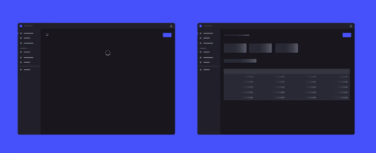
We started off by auditing our current loading experience. Our designers only had spinners and progress bars to work with. So we researched alternatives that could complement the loading experience initiative.
Then we launched tests to measure frustration and time perception in users. What we found out was how loading skeletons were significantly more efficient for our use cases! We tested a few versions to find out which combination of animated elements (the shapes, colors and speed) performed better.
When presented with screens with loading skeletons, users actually perceived time to be passing faster and therefore felt less frustrated, and our product was perceived to have improved its performance without any technical improvements.
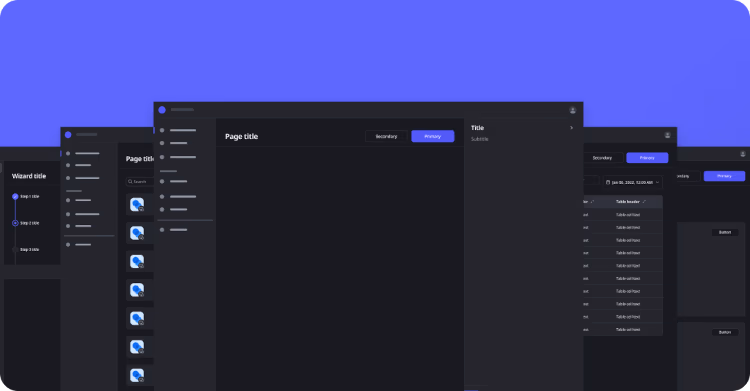
Great success! The insights from the tests were shared with the product teams. We then designed loading skeletons for our different page scenarios, with guidelines on when to use each.
We also passed the specs to the design system team that would then ensure these components were correctly added to the library and code, and once that was done we added the guidelines to the design system documentation!
Motion defaults into the system
Something we are constantly bringing up is how a design system isn’t a bunch of guidelines from designers that developers must then follow. It's design and code translated into ready to use components and behaviors documented as guidelines. It facilitates building our product, changing and evolving it. A motion design system is no different.

So we needed to research and define interaction patterns for our design system components, make them into motion tokens and find a way to document their animated selves, both to communicate them to developers and for presenting guidelines.
And by adding motion in the components themselves not only we guarantee those interactions by default, but also that they are consistently used.

Beyond the motion design system
Improving the overall experience of your product with interaction is not an easy task that a motion design system will magically solve. In an organization as large as OutSystems, guidance over governance makes a difference. We can only make the pieces.
Getting these foundations up and going to tackle small interactions is important so you can move to the real challenge: overall screen behaviors, triggers and patterns.
Suddenly you’re not just adding interactions to specific components for Designers to use, you now need to consider different use cases that can have their own motion choreography - how elements enter and exit, what hovers make sense, how pages transition from one another.
This is where layouts and page types come in. By researching and defining specific page types, we have begun the process of associating patterns and behaviors to specific layouts. Is an ongoing work that involves a lot of communication and alignment between teams, but it’s a quest we are all very excited about!
Prototyping support
Another huge opportunity that brings the Interaction Design team and the product teams together. Designers can learn how to bring hi-fi flows to life for testing, get inspired with motion patterns or to better communicate a proposal to stakeholders.
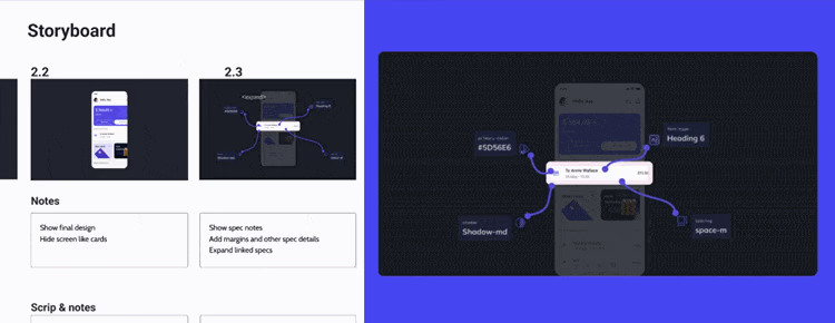
So to encourage our designers to prototype more and faster, we prepared guidelines on when to do lo-fi and hi-fi prototyping. To facilitate the most complex prototypes we prepared a Figma file with examples of how to use our Design System components on prototypes, from easy interactions to more powerful practices. And now we’re collecting feedback!

Proving value
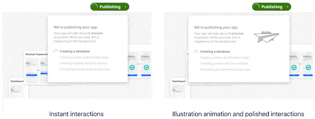
Every design proposal needs to be backed up with data or properly justified. If the user is already getting from A to B, it’s difficult to explain the value of smoother animations.
This is why we use hi fi prototypes and “before and after” comparisons. When people see how much of a difference it makes, they are more willing to make time and invest to make it happen. Besides, it is impossible to explain animations without showing (because it just looks like us pointing into the air and making “swoosh” and “boop” sounds…).
When people saw several side by side comparisons they understood what we meant, liked it better and wanted it to be real.
Telling a story
Building a Vision plays a crucial role in shaping a clear and consistent direction of where we want the product to go. Motion sets the tone. It turns ideas into realistic possibilities , and produces sharable visuals to bring to stakeholder conversations.
It often starts with a story, brought to us by product designers. And it ends with either a fully functional hi-fi prototype, or a ~3min video.
These videos are less expensive than jumping to development.
By the way, you don’t always need video experts to do this Vision video. You need to animate to show animations, but to present an alternative experience, simple figma prototypes or even a slideshow with static screens is enough to tell a story. You can even narrate it yourself and record it with zoom.
Pro tip: Use zoom to record yourself interacting with a hi-fi prototype and narrating the story. No expert video editing skills required!
Conclusion
Our biggest lesson: people need to see it to believe it.
That’s how you convince a full company, stakeholders and product teams to make time for this kind of research, to include interactions, to consider alternative ideas.
Start small, find the right opportunities to prove value and slowly build a dedicated team.
- Show the difference animation makes with side by side comparisons
- Research topics that benefit many teams
- Tell stories, visually. Look for opportunities to innovate and improve the product, and make them (almost) real to your stakeholders and teams.
- Start with an audit of the product pages
- Get a design system in place
- Add interactions to components so they come by default
- Promote prototyping by teaching and providing materials for others to use
- Work together with the Design System team.
There’s still a lot of work to be done and many things we’d like to do more consistently. We are approaching more challenging topics like responsiveness, accessibility and learnability.
The truth is, when good interactions show up on a part of your product, the parts that were left behind start to feel off in comparison. In time, smooth transitions and animation are expected, and becomes the new standard.
We’ll keep showing value and telling our stories, stay tuned for more!
A big thank you to Andreia Mesquita for making this team possible and to David Monteiro and Rita Matos for being part of this journey!


