The Silky Road to OutSystems UI: A Mobile Application Tale
When I joined OutSystems to work as a user experience/interface (UX/UI) expert, my first assignment came with an entirely new challenge.
“Please don’t create any new patterns; just use OutSystems UI.”
Yes, that’s what they said. And what did it mean? That I must create a mobile application with out-of-the-box patterns available in the platform. No new stuff. Create without creating.
Not only had I just arrived at a new place with new ways of doing things, but I was also coming from a place where I always played by my own rules when creating silky smooth user experiences. So, this was new and challenging, but at the same time quite thrilling.
I took a moment to think about what I should do next, grabbed some coffee, and defined my strategy. Yes, the limitation was unusual, but it was essentially another project like so many I’ve done before. So why not do it in the same way? Let’s give it a try.
Step 1: Get the Context Right
First things first. I took some time to analyze and reflect on the business goals and user needs for this application.
Picturing it at a high level, I saw that my app was going to be used by government workers who needed to “go mobile” to request specific services anywhere, anytime.
They might use the app in the office, but a more typical scenario is being in a crowded street with little or no light, struggling with distraction. Then I broke down the requirements as follows:
- Government workers: The app must comply with accessibility standards.
- Going mobile: Chances of broken flow. Minimize that, creating an intuitive and straightforward flow.
- Requesting services: It’s preferable to ask for a selection from given options than to ask the users to write. Writing is a struggle in mobile. Also, make sure options are “finger-friendly,” which means using 48px for tappable elements like buttons with at least 8px between them.
- Limited control of light: Assure great contrast.
After I managed to gather all this context, I was ready to define my main use case. But, let me share some thoughts on context. It’s crucial that you draw conclusions for all kinds of sources. It doesn’t matter if it comes from a customer quote, a user confession, a requirements document, or a brainstorming session.
Collect data, all data that you can get about the way the app will be used. That’s always my first step, and I believe it should be anyone's first step, too.
Step 2: Defining the Main Use Cases
Having gathered all that context, I continued with something familiar: defining the main use case.
With the feedback from user interviews and observation, I analyzed the main use cases to be completed in the application and figured out things like triggers, desired outcomes, base knowledge, required knowledge, and artifacts.
This is really important because I can then break the use cases down into tasks, which helps me understand how can I improve the experience:
Can I skip steps or do I need to add new ones? Do I need to provide extra guidance to the user?
In my app, the primary use case was requesting a service of a specific type.
This implied not only the service request action but also lots of relevant information, like information about the service, the documents needed to request it, the typical response waiting times, and the corresponding physical location where a user could request the service as well.
Another relevant feature was a search field so users could quickly find a specific service they were looking for.
This is where things start to take form. Now that I have my main use cases defined, I can begin to draft the information architecture and the app flows and map all these needs to menu entries or screens. In my case, I jotted down something like:
- Homepage - A homepage where I can display services. The pending services, the completed ones, and the most used.
- List of services - A list of services with an area for service overview, such as the place where the service is done, and a search to quickly find the wanted service.
- Forms - Forms with selections, date inputs, uploading mechanisms for files, and most likely a wizard for some of the forms that have several steps.
- Transaction History - Transaction history with pending and completed services to be able to show service name, request id, status, date, and to be able to enter the request’s detail.
Step 3: Let’s Create
Typically this is the time when I already have a good idea of what my application will look like, and I take a look at what’s out there. Dribbble and Google are my best friends at this stage. I explore the possibilities and start sketching my application. Not this time.
This was the moment where things took a turn in this particular project. I had to deep dive into OutSystems Mobile UI. I went through all the navigation options, the possible patterns for displaying pending and completed services in the homepage, and the remaining identified user stories.
At this point, I found myself smiling.
OutSystems promises a “dozen ready-to-use UI patterns,” which really translates as having hundreds of possible combinations to create this app without the need to change any pattern at all! I just need to make a choice of what fits better for each purpose.
It was a bit like going shopping. I could pick the pattern that I felt was the most appropriate for my scenario from several options and just play with them to get a good fit.
There are so many different ways to solve a screen dilemma that I realized that having the building blocks available doesn’t mean I am not creating; it only means that pattern research is done for me.
And the real beauty? It’s not just thinking about the little building blocks; OutSystems UI also provides samples of entire screens. Yes, they can always be customized with different patterns, but I can provide value to the customer much more quickly than I used to.
Step 4: The Solution
Now that I felt like a rich person with a free pass to use whatever I needed, I created my solution. These were my weapons of choice:
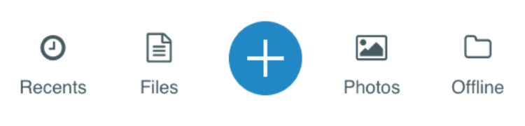
- For my app homepage, I needed five menu entries, so I chose the Bottom Bar Item. This kind of menu is appropriate for no more than five options and always remains visible on the bottom of the screen (except for on detail pages).
- Also on the homepage, to represent the number of complete and pending services, I went for the Counter pattern. It displays a highlighted number with a label and acts as a link to redirect the users to the history page.

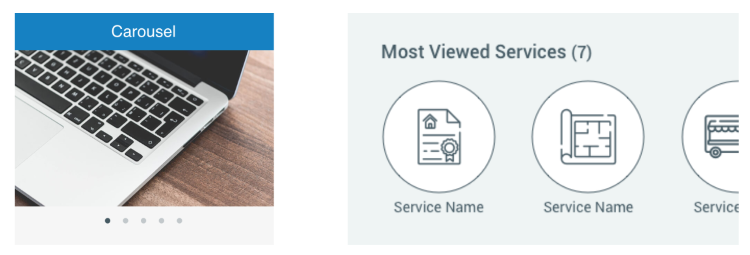
- I wanted the list of services to be different from the actual service page, where I list all services. So I selected a Carousel to display the seven most-viewed services, where the user could just swipe left to see an “All Services” option that would redirect to the complete list of services.
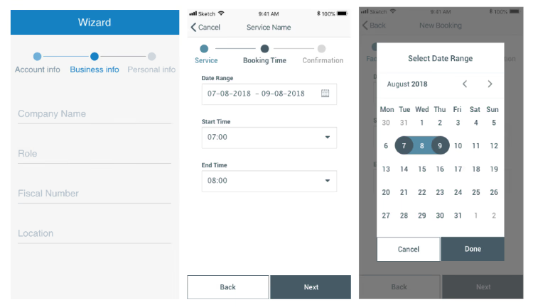
- For the multiple-step forms, I selected the Wizard with the Form pattern for the fields and a Calendar for selecting date ranges.
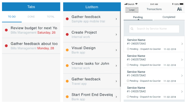
- My choice was simple for the Transactions page. The Tab pattern fits the purpose superbly, presenting both pending and completed transactions on the same page. For the transaction itself, I selected the ListItem since it allowed me to show a status, title, and description while showing users where they can get more detail.
My Own Silk Road
In the end, I had a smooth application that met the customer’s expectations. And, the app developers were really thankful, too. After so many battles with developers about what’s doable or not, it felt good to have their approval for a change. That made me think.
The same way that the ancient traders took on the challenge of using the ancient Silk Road to find the best routes to do business and explore new frontiers, it’s our job to create new experiences that explore new places with a silky smooth feel.
This is also what OutSystems does today with its UI framework—with the underlying promise of making everything faster.
Mainly, I learned that, even if I first thought the UI framework would restrain me from being creative or even affect the user experience, I was given an excellent opportunity to test the ability to deliver optimized UI elements that met the client’s requirements.
It was a journey of discovery for me, just like the first commercial trading routes were. The funniest part? When I talked with my team, I discovered that OutSystems UI was called Silk in the past. So much for coincidence.