How Failure Led to Text Merge Success
I am going to be completely honest. I’m a mess. I keep on tripping, forgetting things, dropping things. It’s my nature. I try to fight this by not wearing high heels, by writing things down in a notebook I always carry, by not walking around holding my coffee. Since I just said, “I try,” I bet that if you dropped by our Braga office, you would probably see a few stains in the carpet. But hey, I don't mind making mistakes, and that’s because…
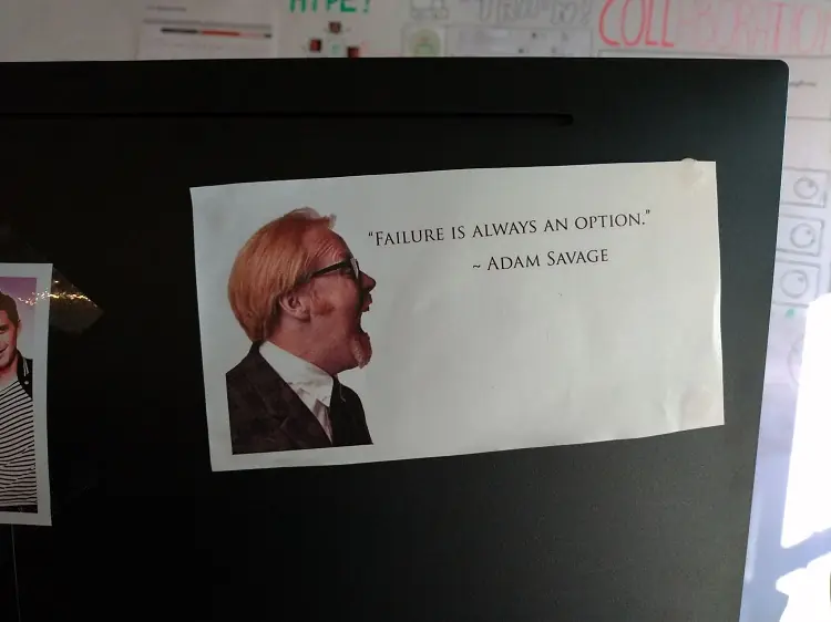
One of my favorite quotes is “Failure is always an option” by Adam Savage from MythBusters. I strongly believe that making mistakes shows us what we did wrong and, consequently, how we can do better. And what does this have to do with text merge? Let me tell you a story.
The Infamous Flag Problem
For the past two years, I've been working at OutSystems as a software engineer, and I am part of the collaboration team. As the name suggests, we work on anything that helps our OutSystems developers collaborate. When I joined, we had all been recently hired because the team was brand new at the time. As you can imagine, we had little knowledge of OutSystems. Our first big challenge was to improve the text merging (aka text merge), and I was excited to understand what was lying ahead for us.
I remember talking to one of my colleagues (an OutSystems developer) and asking him, “So, do you merge a lot of text?” Well, not quite. And this is when he told me about the Infamous flag problem. Instead of merging text, when they were about to publish or work in a specific textual element they would raise a flag to alert their teammates. The message was something like: “Watch out! I am changing this, don’t touch anything!” Everyone I asked said the same thing; people raise flags. These could be actual flags, verbal warning, chat messages, and the funniest one, at least for me, wearing a hat. People didn’t trust the (merge) system, and that was scary.
Building the Solution
The best way to regain their trust was to start with an amazing user experience. At the time, everything related to design and user experience happened by collaborating with the product design team. Working with them was a cool experience because they embody failing, which is fascinating to me. I know this sounds weird, but let me explain. Their work method is to iterate from the beginning to the end of a task or project, which means they try something, test it, fail (potentially), fix it, and start over until it is done right! Each iteration reduces the number of possible solutions. Each test demonstrates what could potentially work. You don’t guess what will work; you know it will work.
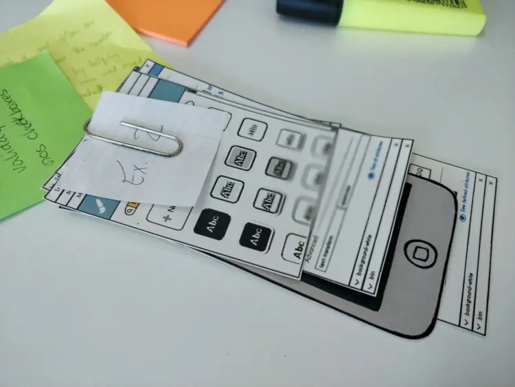
They use this amazing thing called paper prototyping. Several parts of the mockup are printed on paper: the main screen, the buttons, messages, any content that changes with user interactions. So for example, the user simulates clicking on an element in the screen (for example using a pen to "click" a button), and the button disappears (swept to the side by the person conducting the test). Then, a new paper element corresponding to the result of that interaction is placed on the screen.
The product design team comes up with a solution that is user approved without having to spend any of my team’s time and resources by implementing something that may not work. Neat!
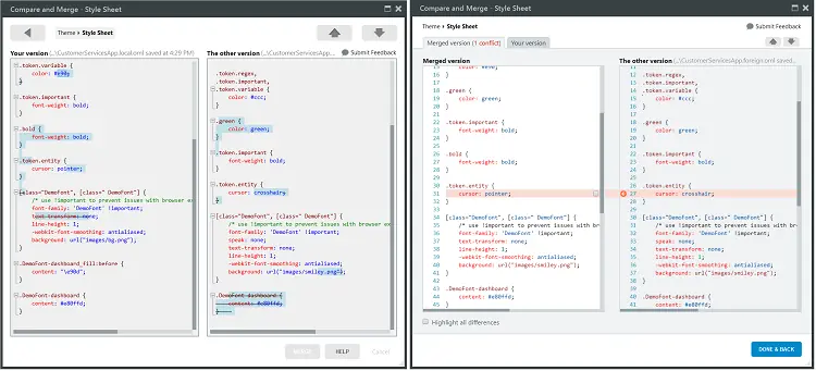
As such, the text merge prototype was iterated, tested on paper, and finally given to us to include in the new beta version of Service Studio, the OutSystems IDE. The new text merge experience was born. The paper prototype was now a functional editor, so we took it to our users for usability tests, and the results were shocking! They didn’t understand the textual differences, they lost code, and they were frustrated. What had happened?
We didn’t understand why we’d failed. But in hindsight, the cause was clear. Life happened. We were in a rush to deliver on time. The Product Design team had been too optimistic with the usability tests. They had been too close to a “happy path scenario” and not a real use case. And we, the collaboration team, hadn’t delivered everything that was on the prototype. The combined errors led to a confusing and error-prone merge when we did the usability testing with the users.
Stopping and Thinking!
At first, we were frustrated. We tested everything, and the project seemed to have failed. So we decided to face reality: something went wrong.
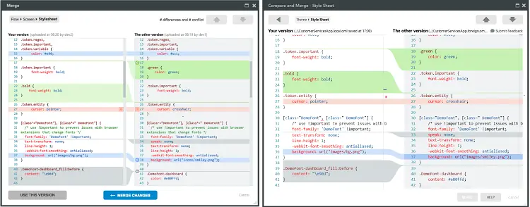
We could see that the editor was overwhelming, error-prone, and confusing. So it was back to the drawing board, and the prototype was once again iterated. With the new information, we decided on the first and most important improvement: we would automatically merge everything that was not a conflict, reducing the developer’s workload. We overhauled the difference-identification algorithm, which made everything more readable.
Next, we decided to split the merge and compare operations into different tabs, so the user could more easily access the intended information. We decided to display only the merge conflicts, so the developer could focus on what the algorithm cannot automatically do. We also added visual accelerators to speed up the merge process (and a lot of more cool stuff!). Finally, we added a pop-up window that redirected the developer to the first pending conflict if they were to attempt merging the element without handling all the conflicts. On the last round of usability tests, it was a success! So we started implementing the changes.
Halfway through that process, we conducted more usability tests. This time we decided to proactively check, not waiting until we’d finished the implementation, avoiding any surprises. You may wonder how we test something that’s not yet finished. It’s simple; we just merged (pun intended) both the paper prototype and the real-life implementation. We were eager to see if the users lost any the code, but the strangest thing happened. Most of the developers merged with success, but once again, they became frustrated. Some of them even gave up merging halfway through the test.
What had gone wrong now? Everything had seemed to be in working order. Well, actually, almost everything. I noticed something odd; there was a button that had been modified in the prototype, but hadn’t been updated when the prototype was implemented. The merge action button was always disabled. But the users were expecting it to be available for ending the merge operation, and when they couldn't do this, they weren't happy about it. It distracted them from their main goal, and yes, it was our new top issue. So this failure was proof that the prototyped solution worked!
Finally, the big moment came, we tested the final implementation. And guess what? No severe issues were found.
Everyone was Happy 😊
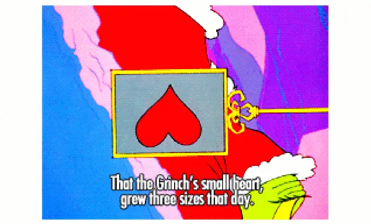
During one of the usability tests, I heard the most beautiful poetry: “This is blue and it says merged, that gives me confidence.” And at that moment, I felt like the Grinch. My heart grew three sizes bigger. We finally regained our user's trust.
I was happy. My team was happy. The product design team was happy! The developers were happy. I listened as they told us how helpful this editor would be for their daily work and as they asked me when they could get their hands on it.
This was a huge win for everyone, and the funny thing is that this was all possible because we made mistakes. “Failing is always an option.” Sure that’s true, but we decided to embrace these mistakes, learn from them, iterate, adapt, and succeed.