UX for Mobile: The Rise of
Fat-Finger Design
We already know that users are turning to mobile for all kinds of needs: from simple-search to shopping, to the use of financial apps. And we also know that mobile-friendly websites are better ranked. But at the beginning of 2018, Google announced the mobile-first indexing since a lot of user searches are made on a mobile device.
And if you have any doubt about it, Statista clearly shows that the global digital population as of July 2018 is 4.1 billion, from which 3.8 billion are uniquely mobile internet users. It’s estimated that this population will grow to 4.78 billion until 2020. So there’s no doubt about it: now is clearly the time to go mobile.
Where to Begin
First things first. Mobile requirements are different from web, and we need to adapt. More than that, we need to be able to work in a new mindset; one where we guarantee great performance and compelling experiences while dealing with limited real estate to work with. To achieve that, there is a series of good practices that I recommend you follow. Let’s talk a bit about them.
Context Matters
Whenever you are designing you should keep in mind the user context, and there are many layers to it. Always keep in mind the business context, culture, environment, activity, their goals, the available attention span, the expected tasks, the device in which the user is having this interaction, and their available connection. And we must mitigate this carefully as it will help us define everything else.
Responsive? Adaptive? Native? Hybrid?
Mobile can be developed in many ways so you must decide if it is a responsive website, adaptive, a native app, or a hybrid app.
Responsive gives you an optimal viewing experience for any device as it uses fluid grids that adapt the layout automatically to the device size.
In adaptive design you have to design multiple layouts for different screen sizes, ensuring that when a device is detected, the correspondent layout is presented.
On the discussion of whether it’s better to have a native app (an app that is coded in a native mobile language) or a hybrid app (an app that can be coded in a different language that caters for more than one operating system), for many reasons a native app might be a better solution and will end up delivering a better user experience.
The choice is yours, just make sure that you are careful about conventions. It’s easy if you are designing a native mobile app since conventions depend on the operating system. But if you are going for one of the other options you really need to pay attention.
For example, bottom navigation is a pattern used normally in iOS, so an iOS user will be used to seeing the menu on the bottom; whereas for Android users, top navigation is familiar.
In iOS, the back button is always on the top left side of the screen, while actions are on the right side. Android users, on the other hand, have a physical back button, and hence are not used to top back buttons.
To explore patterns and conventions you have lots of references you can use, such as Human Interface Guidelines iOS, UI Design Dos and Don’ts iOS, Android Design, and Windows Design Basics for UWP apps.
Remember How You Really Hold and Touch Your Device
Steven Hoober discusses this in his book Designing Mobile Interfaces and in an article for UXmatters. He tells us the way phones are held depends on the device, user needs, and obviously the context. People will change their device’s orientation without even realizing. He also says that 75 percent of users touch the screen with one thumb, less than 50 percent use only one hand, and 10 percent hold their device with one hand and interact with the other. 36 percent cradle their phones using the second hand for better reach and stability.
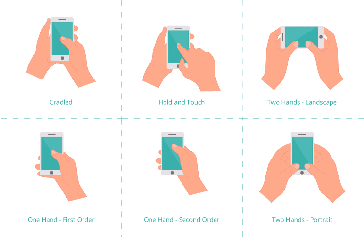
Another interesting point from Hoober’s research is that mobile users do not read in the F-shape as they do on desktops. In mobile, users tend to look at the center of the screen and prefer to touch in the center as well.
All this information must be taken into account when designing your apps. But it doesn’t end here.
Be Fat-Finger Friendly
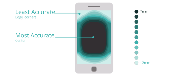
What about people with huge hands? Yes, you have to include them too. In mobile, interactions happen with a finger touch and not a cursor, so size does matter! The size recommendation for a mobile touch target is 9mm or 34px, with minimum space between elements of 2mm or 8px. The smallest size possible for a target is 7mm or 26px and the optimal size is 48px with 8px between elements.
It’s critical to design with the thought that most users are using their thumbs, and no thumb size is equal, in mind. Pay attention to this to ensure that errors are avoided. Think about all your users, even the ones with ginormous hands.
Navigation Is Key
Navigation is a huge part of a good experience. To start with, it should not take up too much space on the screen, and it should be easily discoverable. To cope with navigation, there are four common patterns: top navigation bar, tab bar, navigation hub, and the widely discussed hamburger menu.
- The top navigation bar follows desktop logic and is good when you only have a few menu entries, even though Google Play evolved this menu with a carousel to allow more navigation options. Usually, the navigation bar disappears as the user scrolls down and reappears when scrolling up.
- Very similar to the top navigation bar, we have the tab bar, which fixes the issue of the top navigation bar, meaning it is always present. Like top nav, the tab bar should not include more than five options. If you have more options, you can create a carousel, but it’s usually more pleasant for users to include a “More” option in the fifth position to open the remaining options. For accessibility reasons, always label your icons and be sure the icon you choose is easily recognizable by looking at it.
- Mostly used in task-based apps, we have the navigation hub. This navigation exposes all possible options on the homepage, and the user must return to the homepage to navigate elsewhere. What?? Yes, you will lose the content in the homepage, but then again there are websites and apps where no content is needed.
- Last and least (ask any UX designer) is the hamburger menu! This navigation is suited for sites and apps with a large number of menu options and allows for submenus. When compared with other navigation patterns, it uses almost no space on the screen. So what's wrong? Well, not everyone knows the meaning of the hamburger icon. Sure this can be solved by writing “Menu” instead of using the icon, or you might use both the icon and a label. Still, all the navigation is hidden from the user, so you have to be thoughtful on how you represent which page the user is on and the current navigation path. Otherwise, the user will have no clue where they are. And remember, if the user does not understand how to navigate, they will end up abandoning the app.
Gestures
Unfortunately, we still lack a convention or set of established guidelines for gestures. One of the most widespread assumptions is that users will perform gestures that will reveal the action in need, but sometimes it is not that simple. In reality, users have no clue which gestures to use to do the correct actions. They are hard to discover and to retain, and can actually burden the user with an excessive cognitive load. This can be rectified by giving the user a contextual clue; redundancy in these cases actually improves the experience.
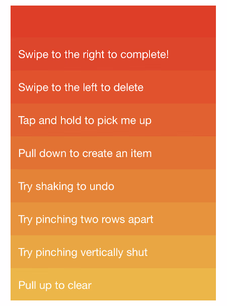
In 2012 we had an example of a gesture-based app called Clear Todos, where you would swipe right to complete an action, press to restore a list item, swipe left to delete (which is commonly used in apps nowadays), shake to undo actions, tap and hold to pick, pull down to create an item, and pull up to clear, among other gestures. This is a good inspiration to use when building gestures into your own app.
Care About Content
We use apps to create access to information, right? So, content should be taken care of with a method. For instance, time-sensitive information (like events or deadlines), contact information, and location-related information must have some prominence so they are easy to find.
When we face pages with a lot of content, we can explore various solutions. Elements like accordions and back-to-top buttons are very helpful in these cases.
It is really important to use progressive disclosure. You do not want to overwhelm users with content; you can give them the main content and create ways for them to go deeper. Believe it: progressive disclosure is your BFF!
Also, use appropriate font sizes in your content, do not use less than 14px, considering the optimal font size is 16px to ensure readability. If you are using a 14px, use it in bold.
Another critical point to facilitate comprehension is to use a clear and simple language to communicate; use terms the user can relate to. As we spoke earlier, users look at the center of the screen, so try to put key content in the center and make sure the navigation does not obscure it.
Select Your UI Elements Carefully
Mainly because of the progressive disclosure, the number of taps is relevant. We should guarantee the least possible number of taps to perform a task, and no, this does not mean we should create strange flows to complete a task. This means we have to carefully select the elements we use in our interface, always keeping in mind we are using our fingers and not a cursor.
Avoid elements that can cause frustration and long interaction times for simple interactions. Things like dropdowns, where the user must repeatedly tap to make a selection are a poor choice for this kind of environment.
Using the right elements can speed up the completion of a task by up to 60 percent as this study shows.
Onboarding Screens
Onboarding screens are a typical feature in a mobile app. They are wonderful to show branding information and to give a sneak peek of your app. Typically you will have a splash screen which is followed by some tutorial screens. A few years ago there was a trend to have lots of tutorial screens, which was an error according to a study by the NNgroup. So, keep them short in number and concise to the main features of your app. Make sure that you have a skip option that gives the user control if they don’t want to see tutorial screens.
Avoid Registration and Login Pains
Is it indispensable to ask your users to log in? Is there any real value for the user to do so? This is the questions you should ask before assuming there should always be a login. You should allow as many features as possible to users without them having to log in. A good practice that is thankfully becoming more widespread is a guest checkout in e-commerce environments, where the user can buy whatever they like without having the need to register.
Still, if you create a login, make sure you clearly explain why this is an advantage to your users, and to help them, give the possibility to log in through social or Google, eliminating the effort of creating an account.
If a social login is not an option, and you are in a use case that requires a specific account, keep the following in mind:
- Ask for the essential information only, typically an e-mail address. Leave any other information as optional.
- Regarding passwords, remember that a mobile device is much more error-prone when filling inputs, so allow them to see the password they are entering. And by all means, DO NOT ask the user to type it twice! If you let them see the password there is no reason to ask for it twice—it is just painful. Another good pattern is to give a strength meter. It provides feedback to the user and makes them feel more secure with their choice.
- In a login situation, mask the password and have a show password element. Try to take advantage of the device’s touch ID if possible. This makes the login smooth and easy for the user.
A final remark on registration: don’t make it hard by asking for confirmation by email. If you really need to ask for confirmation do it by SMS code, this way the user does not need to leave your application since the message will appear on the top of the screen and they can see it and enter it, avoiding interrupting the registration flow.
Forms
Forms are usually tedious, so imagine it in a mobile device. This should be enough for you to create the best form possible. How? By using a one column layout instead of breaking the form in multiple columns.
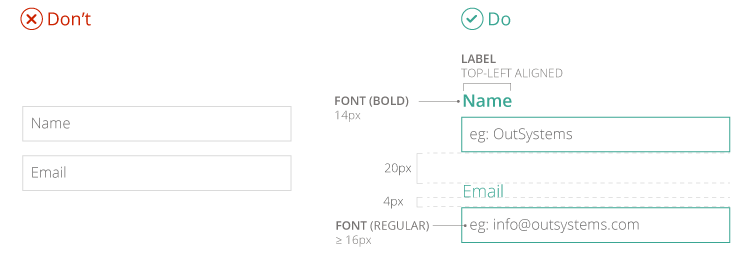
To make it understandable, group related information and make sure that all labels are close enough to their field to be understood. Also be sure the input fields are separated enough so they are not on top of each other. Follow the rules in the following image, and you will be safe.
If all fields are mandatory except one or two, it is preferable to write “optional” in those, rather than having asterisks pollute your screen.
Be sure the input field is big enough for what is written inside and it is still visible when the keyboard is showing. But try not to design large input fields if the input is small. Button labels must be descriptive enough for the user to be sure of what to insert. Also, always use inline icons on validation or error messages of input fields.
Tables
Tables are always a nightmare. Usually, we have a lot of data, and we must find what is meaningful to present. As the NNgroup suggests, the best approach when designing mobile tables is to first create a usable table for large screens knowing you must then translate it to a smaller device.
Sticky headers improve the experience since the user will not lose the context of what they’re looking at. It is ok to use a horizontal scroll, as long as it is clear to the user what they’re looking at. You can make the first column fixed, so the user does not lose context.
When you have data that fits into categories, use accordions; this way the user can have an overview of all data and open whatever interests them.
Looking Forward
Don’t think of mobile interactions as you would in a desktop. You have a sea of possibilities for new interactions. There is touch, voice, gestures, cameras, fingerprint and face recognition, compasses, GPS, and many other tools that allow creating new and fresh ways to interact with the world around us.
To get you going, OutSystems UI has a lot of patterns you can choose from if you want to start experimenting with what it’s like to design with the mobile mindset.
