Best UX Practices for Web and Mobile Applications In 2020
If you’ve followed user-experience at all in the past 10-years, you know that when an organization prioritizes user-experience, it wins — big-time.
In one study, companies which optimized for end-users increased their revenues by an average of 37 percent.
And according to Frank Miller, Chief Experience Officer at Experience Dynamics, among the Fortune 500, those companies which dedicate themselves to UX outperform members of the S&P by 3x.
These gains come largely from the fact that consumers, and humans for that matter, prefer a great experience — who knew?
When Choice is Abundant
Experience drives demand. While some may perceive UX as a relatively new field, it has been in practice since the dawn of commerce.
When competition is present and healthy in any free market, its competitors must turn to the customer to differentiate themselves.
And while this post reflects largely on the user-experiences provided through software, the broader definition of UX encompasses any point-of-contact between a person and a brand, organization, or system.
Despite the presence of UX across all facets of our day-to-day living, both physical and virtual, we’re finding more of our lives taking place online and in digital spaces, especially in 2020.
The Covid-19 Race to Digital Transformation
Thanks in part to the pandemic, when it comes to the digital transformation of all human behavior, we’re ahead of schedule, gang!
According to research done by McKinsey Digital, the pandemic has inspired 35 percent of Gen-Z to use video chat for the first time. And they found that, “54 percent of households with incomes greater than $100,000 have tried online streaming,” again, for the first time.
Executives are taking notice.
A recent survey by Dresner Advisory Services revealed that 49 percent of enterprises have launched new digital transformation projects or have moved up the timetable on projects already in the works.
And according to Synergy Research Group, enterprise corporations spent $29 billion on cloud infrastructure in the first quarter of 2020, a 37 percent increase year-over-year.
UX will remain a vital factor in the coming decades as succeeding generations increasingly turn inward toward private, virtual interactions to satisfy their wants and needs.
For an overview of these expectations and how best to apply UX practices to your organization, watch my half-hour tech talk, UX/UI Design for OutSystems.
UX in Application Development in 2020
… is largely expected.
One study claims 88 percent of online consumers will not return to a site after a bad experience, 15.8 percent are less likely to switch brands when the user-experience is great, and 61 percent will move to another site if they don’t find what they’re looking for immediately.
I believe this is in large part because customers are too familiar with the effective design patterns in mobile and web application designs.
These patterns are so well known that users who find them absent or confusing in our applications skip directly from ‘inconvenienced’ to angered; they know competitors who follow best practices and wonder why we chose anything else, why we chose to irritate them.
In 2020, the pressure is even higher for competitive organizations and government entities to deliver the application experiences which B2C software companies have delivered for years.
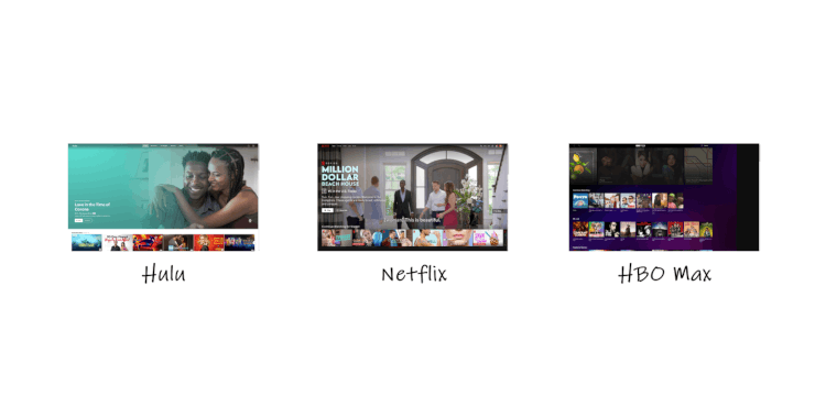
A great example comes from streaming services; most follow a general template of behaviors that make it easy for new users to perform common actions:
This isn’t to say we should copy one another verbatim; there is always, and will always be room to innovate within application development. However, established industries establish base expectations, users learn what to expect.
For example, a restaurant that seats you and your partner in the dining area meets your base expectations of dining out. Whereas a restaurant that seats you in the kitchen near open flames meets your base expectations of a serious code violation.
The standards are set for almost every end-user scenario, (especially for OutSystems customers) so there are few excuses for organizations who skimp on user-experience this year.
Here’s how to do it right in 2020.
A Reliable UX Process for Web and Mobile Application Development in 2020
At OutSystems, our product teams design new web and mobile applications in 5 distinct stages: Business Analysis, User Research, Wireframing, User Testing, and Visual Design.
Let’s look briefly at each one and how they apply to a fictitious internal application we’re going to call, Referry.
The Referry web application will allow our HR staff to accept referrals for job openings, both internally and externally, provide incentives to referrers, and synchronize this data with private internal applicant evaluation tools.
Business Analysis
At the very first stage, our designers meet with product stakeholders to determine the business purpose of the product. It’s critical to answer the following questions during this stage:
1. Which activity(ies) do we wish to encourage with this product?
What are the outputs, the inputs, the process we are attempting to streamline?
2. How do those in (a) benefit the business as a whole?
Is it worth building and maintaining this product, can we foresee this bringing a positive ROI in due time or are we merely itch-scratching?
3. Who needs to ‘buy-in’ in order for this product to succeed?
The stakeholders want the product to succeed, but they are rarely its only users. This step helps us identify for whom we are building the product.
Entire projects can fall apart at this stage, and that’s a good thing. In UX, as in all things, figuring out what we must do is equally important as discovering what we mustn’t.
In this case, we’ve determined that Referry would reduce scattered referral communications and weak oversight by centralizing the referral process.
It will also encourage more people to submit referrals (esp. cross-department referrals) and bring in a new avenue of referrals by exposing portions of the platform to 3rd-party placement agents.
Referry is go!
User Research
Having determined who our end-users will be, we must now study their working environments and how they might incorporate the new product into their day-to-day workflow, if at all.
In this step, we not only interview our future end-users, but if possible, visit them at their place of work (our teams actually do this).
The in-person visit gives us critical insight into the conditions faced by users, insights we cannot glean over the phone.
In the Referry example, we discover that internal employees are unlikely to dig into job descriptions and requirements, but are happy to submit talented peers from their rolodex to a general pool of referrals.
However, external placement specialists wish to submit candidates for positions which satisfy both parties (the candidate and organization); job-specific submissions are key for their persona.
Lastly, the HR staff who will field submissions wish to avoid duplicate entries (which they deal with all too often in the old system), and this guides us toward a system whereby we will identify existing entries and consolidate submissions in a way that makes sense to HR.
There’s much to learn in the research phase, including environmental factors that effect our user’s ability to interact with the application (dimly lit rooms, limited hardware inputs, sparse network access, etc.).
I go over these and more in my 30-minute tech talk, check it out for some real-world examples.
Wireframing
Once we understand the solution we need to build and for whom we must build it, we rapidly iterate our low-fidelity wireframes. Wireframes are a sort of sketch, or outline of an application’s interface, the ‘screens’ in the application.
These screens often lack the typography, photography, color, and overall brand-feel of a finalized product, as well as true interactivity or real-world data. But we build them to demonstrate flows, and flows represent the steps an end-user will take to perform a single action.
We’ll see how these flows come into play in the next step.
In Referry’s case, the flows may include:
- Signing up as a non-HR employee
- Signing up as an external referrer
- Signing up as an HR employee
- Submitting a single referral as a non-HR employee
- Submitting a single referral as an external referrer
Once we’ve drafted and revised wireframes for each critical flow, we’re ready to move to the next step.
User Testing
Yes, testing before building, validating before dumping (tons of cash) makes all the sense in the world, yet many skip this stage due to over-confidence and indulgence in the time-honored corporate tradition of ‘we know our customers better than they know themselves.’
But according to multiple sources, fixing a user-experience issue after releasing a product is 100 times more expensive than simply doing it right the first time. We avoid that cost when we generate a simulation of our application that brings our wireframe flows to life.
We place our end-users into these simulations, task them with completing a flow (action), and observe their behavior. Vital to this step is listening to the user’s feedback and watching for physical cues.
Often, users are incapable of verbalizing what they perceive as wrong with an interaction, but will react to it negatively all the same.
We watch for overly long pauses, erroneous cursor usage, and other unexpected bumps along the road to successful task completion. I dig deeper into these and other user-testing tips in my tech talk.
After testing, we pool the insights from our research back into the Referry wireframes, correcting where needed, and if desired, perform supplementary user-tests.
Once we’ve sufficiently refined the experience in wireframes, we move onto the fifth and final design stage.
Visual Design
With proper wireframes and flows in-hand, we begin to construct high-fidelity wireframes, or mockups, that include the elements we previously excluded: branding, fonts, colors, images, transitions, and animations.
The design phase is complete as soon as we pass the mockups along to frontend developers. Those developers generate a working version of the application for whichever platform it is destined.
Once we build out our product, we move into a maintenance phase, but the UX work does not stop there.
Along the way, we tasked our developers to build a style guide, a reference library of components that proves indispensable to the application’s continued user-centricity and success.
Remaining UX-Focused After Launch with Style Guides
Style guides are collections of working frontend components used by applications to standardize their appearance and behavior. Brad Frost refers to them as,
“[a] storefront that showcases all of the design system’s ingredients.”
With a style guide in place, upgrades and modifications made to an application can remain consistent with the intents and expectations of its core users.
These guides are especially decisive when the implementation team must hand their product off to a secondary ‘maintenance team,’ an organization that may be unable to access the insights which produced the original product.
Thankfully, web and mobile applications built on the OutSystems platform have instant access to out-of-the-box and customize-able style guides which handle an array of common user-patterns, such as interactive charts, tables, forms, buttons and beyond.
People-Centric App Development with OutSystems
Armed with a style guide and a people-centric approach, your products maintain an above-average level of usability and client satisfaction.
The process of putting users-first, of involving stakeholders early, is what John Machado calls, ‘people-centric design.’ I like this term because a ‘user’ can be faceless avatar, but a person cannot, and people use our products.
That design philosophy is far and away from the traditional waterfall development approach whose dollars-first attitude can sometimes lead to unworkable products.
Teams looking to avoid the fall by investing in user-experience in 2020 should adapt our approach. And those teams who build their web and mobile applications on the OutSystems platform will see a return on their UX investment in record-setting time.

Use OutSystems Now!
Get your first app built in a few minutes.
It's free forever.
With its verbose component system, OutSystems helps teams across the globe build best-practice experiences at 9x the speed of competitors (and without the boilerplate).
Find out how they do it and how you can too by watching my tech talk, UX/UI Design for OutSystems, and thank you for reading.