Ideation of an IDE: Making Better UX Decisions
Is there anything worse as an UXer than knowing your users are having a less than ideal experience? I know; we’ve all felt that pain before.
All companies sometimes face the formidable challenge of focusing on a specific market segment. Inevitably, whether by sheer impossibility or curated decision-making, some of your users will be left behind.
At OutSystems, that’s exactly how we felt about our integrated development environment (IDE), Service Studio. It worked great for our Windows users. For those running macOS? Well, not so much.
But the good news is that OutSystems launched a new version of its IDE in July 2021. Now, there’s a cross-platform Service Studio that allows our users to natively run our IDE on Windows or macOS. This was a massive migration challenge, and we already went into detail about the Engineering decisions behind it from the perspective of one of our principal software engineers.
As Product Designer for this major project, I will give you the scoop on all the UX work behind the screens and guide you along our thought process so that if you ever face such a massive challenge, you can better prioritize.

A Compromised Experience
There’s no other way to say this: Service Studio was built for Windows. Our Mac customers were facing the added cost of providing their OutSystems developers with Virtual Machines (or computers running Windows) or dealing with the suboptimal experience offered by Service Studio’s Wine version.
Believe me, this was not something we could blissfully live with. At OutSystems, we take pride in our UX Team and are committed to growing our practice, consistently delivering a product that users will love.
So, we were driven by giving our users a version of Service Studio they could natively run on their Macs and an IDE we could improve faster. This was not an easy task because we’re dealing with such a complex product.
A Single Stack Service Studio
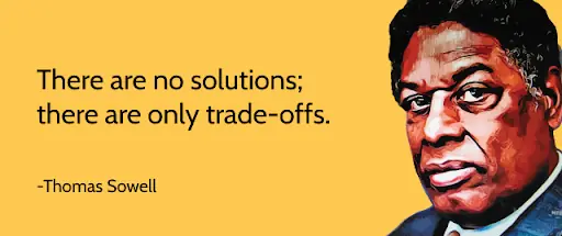
As we began looking for optimal solutions, we knew we had to compromise between technology, user experience, and time. We had several options on the table — a fully-native Mac version, a Web IDE, a Wine version, a partially-native Mac version — and we needed to start ruling them out.
There was already an experimental Wine version of the Service Studio. Wine is a compatibility layer that allows software developed for Microsoft Windows to run on Unix-like operating systems. That was our attempt to cut off time, but the result could be considered sufferable from a technology and UX point of view. We felt it was not the way to go.
After evaluating the technical feasibility, development and maintenance efforts, and the user experience of each solution, we decided that single stack, installable versions for both Windows and Mac were the best approach we could currently provide.
But deciding to compromise was just the first of an array of difficult decisions we had to make along the way.
Decisions, Decisions
First: technology. The team chose ReactJS for its front-end technology, as we had to migrate the entire Service Studio’s interfaces. We meticulously listed all the dialogs and parts of the main interface to estimate the migration effort.
The list rounded off at 70 editors because we treated dialogs and parts of the main interface as editors along with 14 infrastructures. The migration estimate with the team we had at the time? Two and a half years. You read it right.

Needless to say, we weren’t happy to make our users wait that long — it was time to contemplate trade-offs. The first step was running some user experience research to figure out how to cut the Service Studio elephant into pieces. At the time, we aimed to get the best minimum viable product (MVP) and subsequent milestones to iterate before having a complete version with all the migrated editors.
From the dev side, the strategy was to kick off the migration process with the most straightforward editors, such as Login, Progress, or About dialogs, so that the team could learn the technology and work out the most efficient path.
The most extensive, complex editors — we’re looking at you, User Interface (UI) editor — were left for later. This decision naturally impacted what the MVP would be.
As part of our research, we surveyed our community of Mac users, did user interviews, and analyzed telemetry data to discover the most common use patterns regarding the Service Studio functionalities. With this data input, we considered possible MVPs and analyzed their value for users:
- Services-only version: we discarded it because it brought little value, failing to leverage user adoption and, therefore, feedback.
- Front-end development version: we discarded it because it was difficult to specify a valid front-end user journey. In other words, it’s impossible to work on the app’s UI editor without having logic and data editors.
- Back-end development version (logic and data): this was our first chosen MVP — as you might have guessed, we left the UI-related editors for later.
They were more than we could chew at that moment.
At the same time, designers started the mockups for the new version. This was a long-awaited opportunity to create and implement a design system — making our product more consistent, prettier, and easier to use. You can read more about this in a series of articles highlighting how our UX/UI Team tackled the new IDE challenge.
Picking the Low-Hanging Fruit
When you start updating an existing project, you always want to improve it to the best of your ability, and Service Studio was no exception. We had a long list of possible improvements, some of which were submitted by our community of developers programming with OutSystems. A migration seemed like an excellent opportunity to do it all. However, as always, there were constraints.
One of the things we couldn’t compromise was the users’ familiarity with the Service Studio interface. If we did something too revolutionary, users would lose their precious time learning how to navigate it, which would go against our productivity principle. We aim to boost users’ productivity, not hinder it. So, instead of being revolutionary, we opted for an evolutionary approach.
If you’re still thinking about our two-year deadline, let me assure you that Service Studio is a big tool. Two years was actually a tight deadline and an extremely optimistic estimate based on the solution we had.
Did this deadline factor in enough time for potential changes and improvements? *Ahem* But you know how it is when it comes to estimating software development efforts, don’t you?

So, with the clock ticking, we didn’t really have time to design or test massive changes or even the improvements we wished to add. We had to make decisions and make them wisely. If we proposed an improved solution that was more complex to implement, we’d be delaying the final delivery date. To win the race against time, we decided to focus on the low-hanging fruit: high-impact UX improvements with low cost of delivery.
Let’s take the widget Tree as an example. We often observe that new users struggle to understand and find the small button that displays the Tree. In the cross-platform IDE, we created two tabs: Elements and the widget Tree. To change to the widget Tree view we no longer have a small, easily missed button, but a tab — a big hit target that gives the widget Tree the much-needed visibility. Easier to click, easier to use.
On the other hand, it takes up the vertical space from the module Tree, but we decided it’s a worthy trade-off.

Another example where we had to compromise is the Properties pane. It used to be a table, but now we have labels and inputs in the new cross-platform IDE. We’ve designed a better version, where the boolean properties, for example, appear as switch buttons or advanced properties in an accordion-style menu. Still, it’d be too costly to implement at that time.
As it stands, we’re aware it takes up more vertical space than it should, and we’ve already received our users’ feedback on it. All we can ask them is to bear with us; this is just the first step of the improvement path.
Telemetry As a Proxy of Your User Needs
One could expect that deciding on what to compromise would become easier along the way, but that was definitely not the case. As the final delivery date approached, it was harder and harder to let some things go. It was time to embrace an even more meticulous approach, and one tool that helped us achieve that was telemetry.
With telemetry data, we could pinpoint where users interacted the most (or not at all) with the software, which then guided us to migrate the most common use cases first, leaving less used features for later.
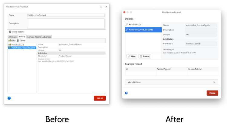
One such example was the often ignored Structure editor — RIP — which we did not migrate as its functionalities are now available within the Tree and Preferences.
We also decided to implement a simplified version of the Entity editor, which contains only the settings that are not available in the Tree and Properties pane.
A Bug That Became a Feature
But the drop list does not end here. The Data Type dialog endured a similar fate, and we let it go due to a bug. Our telemetry data later backed up the decision.
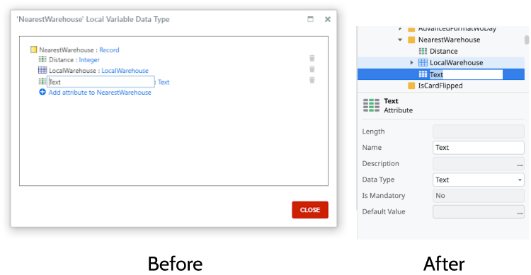
In Service Studio’s Record Data Type, we show the user the data type structure in the Tree. In the previous version of Service Studio, you couldn’t edit it.
However, in the new version, we realized we could edit the structure in the Properties, which sparked an idea: why don’t we edit the Record and the Record List data types there, so we don’t need a dialog anymore? These can be edited as simple data types that don’t require in-memory structure and can be easily defined in the Properties.
This was an important lesson learned: finding redundancies within your product can help you save time and effort when upgrading it.
In fact, what we managed to save in dev costs by not migrating some dialogs, we used in feature improvements whose costs would be otherwise harder to justify. Savings made by dropping the Data Type dialog were invested in further developing the Autocomplete and Search capabilities in the Data Type property dropdown, which previously offered a somewhat cumbersome interaction experience.
Card Sorting With a Twist
Since time was of the essence, another tool that helped us prioritize the work was card sorting. Usually, the card sorting technique is used to understand how your users organize information or create an information architecture, such as a menu on a huge website. We added our own little twist to it and ran an online card sorting exercise with our users to gather feedback and better understand our priorities.
We put each missing feature on a card and asked them to drag each card into one of the following buckets:
- I need these features ASAP.
- I need these, but I can wait.
- I need these eventually.
- I don’t use these.
- I didn’t know these existed.
This gave us an insight into what our users were expecting. Some of the results surprised us: features we thought were must-haves were not that crucial for users. The first law of good UX? Never assume you’re the user.

The Hardest UX Compromise
Like so many other products, Service Studio comes with its own set of tutorials to guide the users on what they should do. What’s quite unique about it is that it also validates the users as they follow our instructions — if the user strays, then the IDE’s tutorial will help them return to the main guided track; when they perform an action, the tutorial lights the way, indicating the next steps. It all happens with a little helping arrow that points users to the elements they need to interact with to complete the task.

Unfortunately, this capability has an extremely high dev cost. The tutorial is essential because it’s there for the user from the very beginning. Still, on the other hand, each user only goes through it once and for a few minutes — thus, it may be considered insignificant for the product experience as a whole.
However, these few minutes are crucial to lure in users or show newbies the value of OutSystems. It also entices them to explore the IDE further. Again, we had to agree on a compromise.
We came up with an incremental solution. First, we made an MVP: when the user clicked on the Tutorial in the Help menu, they were taken to a website with a video recording of a person building the tutorial app and explaining every step. This solution was clearly insufficient — the user would have to juggle between the browser and the IDE, try to remember the steps, and pause or rewind while fiddling with an imprecise playback slider. So, in the meantime, a different group of devs worked on a solution: the “walktorial” (at least that’s how we code named it).

Now, what exactly is the walktorial? We had the idea to create our initial tutorial using the already migrated walkthrough infrastructure. This meant it wouldn’t have the key capability of validating the user’s actions. The user would have to navigate independently, clicking on the Next button after performing the instruction or clicking on the Previous button if they got lost.
In sum, there is a lot less hand-holding. We also had to ditch the helping arrow because we weren’t validating the users’ actions and risked having it pointing to the wrong element. During the usability tests of the MVP solution, we learned that watching the video of someone interacting with the IDE really helped users even if the user experience we provided was far from excellent. This sparked an idea to include animated gifs in the walktorial to better guide our users and ensure a pleasant experience.
We did some user testing and were relieved to see that users completed the walktorial as easily as with the original tutorial. Another one bites the dust.
Changing the Wheels on a Moving Car
One of the most challenging things for a product designer or anyone building software is that any changes to your product or its user experience will be subject to heavy scrutiny by users and will eventually need to be readjusted. During the process of creating the new cross-platform IDE, we learned that the hard way.
As my teammate and Principal Software Engineer João Neves explained in his article, we released the new migrated editors in the legacy (Windows-only) version. Yes, that’s right, our users were partly experiencing the cross-platform Service Studio even before its launch. For instance, one of the first dialogs we migrated was the one displaying the Shortcut keys, which was first released to Beta users and then made available to all users in April 2019.
We created a theme that blended well with the legacy interface to make the migrated editors look consistent. At the same time, we worked on two new beautiful looks for the new version of the IDE — the light and the dark theme.
Although we automated the theming as much as possible, it still added extra work to the checklists of designers and developers. To avoid dealing with a gazillion color variables, we intended to derive the dark theme from an inverted version of the light theme.
But, as we learned:

It just didn’t look good. The dark mode, for example, should have a softer contrast and less vibrant colors. We had to make adjustments, mainly in the text color rules and background colors of some components, such as tabs and inputs.

On top of that, we had different sets of icons for the current and latest versions. As we didn’t want to end with separate icon sets for the light and dark themes — raising the number of icon sets we would have to deal with to three — we decided to compromise once again and find an icon color palette that would work for both themes. It was more challenging to design and test but also more straightforward to implement and less costly to maintain and change when needed.
The story pretty much repeated itself when it came to illustrations. Once more, there were two different sets of images for each version (old and new), and we struggled with the very same color palette challenge.
Now, exceptions had to be made when creating some icons or illustrations, especially for the dark theme, as our creations wouldn’t always work for both. Since we were dealing with a single code, we had to implement a fall-back mechanism:
- The system checks if the user is running the old version.
- If so, it loads a legacy image.
- If not:
- Is the user using the dark theme?
- If so, the system checks if there’s a dark image available, and if there is, it will load it.
- If not, it will load the light theme image.

This required tremendous discipline when creating and committing any image assets, as well as meticulously curating the CSS differences between each theme. Testing also extended for longer than anticipated as every piece of the interface had to be implemented and then tested in all three themes.
How to Keep Everyone on the Same Page
This project started small, with one dev team, but more and more people joined. At some point, we had up to 50 developers, QAs, designers, POs, and tech leads working on this project. At OutSystems, we follow the SAFe methodology in which we have a week of planning for the following five sprints (the so-called Product Increment or PI for short). It helps especially with managing dependencies between teams in large organizations like ours.
Having five teams working on the same project, we realized we needed a central prioritization tool to align everyone with the goals and priorities. We decided to use the user story mapping, a technique promoted by Jeff Patton in his book of the same title.
We organized our pending work along two vectors: the user journey (from installing and opening the IDE to building an app, publishing, testing, debugging, and distributing) and the PIs schedule.

We held weekly meetings where we discussed the items (user stories) on the map: if their priority should rise or fall based on the telemetry data, card sorting, and feedback from customers and users.
Before each PI planning, we decided what we wanted to accomplish based on these priorities and the teams’ delivery capacity. We’d put these user stories in the top-most row of the map. Then we’d distribute them between the groups so that each team knew their work scope for the upcoming PI. This way, we could detect dependencies sooner and avoid them by better distributing the user stories between groups or PIs. Doing this made PI planning, including the dependencies management, much smoother and more predictive.
Perfect Is the Enemy of Done
We were still immersed in doubts, despite two and a half years of hard work in which we tried to achieve all of our goals as quickly as possible. We’re perfectionists who always believe there’s something to improve, and this was no different.
We didn’t feel ready to go into general availability: some features, including one that we found crucial — the edition of the UI on Traditional Web apps — were missing. Besides, we had reported 250 bugs and counting. The quality we aimed for wasn’t there yet. To top it off, the new Service Studio kept crashing more than its predecessor.
We felt trapped in this unsolvable dilemma represented by the famous triangle:

Eventually, we decided it was more valuable for Mac users to have a new and improved version, even if it lacked all the features of the previous Windows version. The attempt release date was set. We stopped development and focused on fixing bugs, adding two extra teams. Moreover, we kicked off the Bugmageddon initiative — in five weeks, we fixed 84 bugs. In this period, we also reached target stability. But more on that on an upcoming blog post.
Finally, on July 29, 2021, the new Service Studio was out, and all we could do was anxiously await our users’ reactions. So far, we’ve been getting a great response.
Some users give positive feedback...

Others are helping us improve…

But, because we value our users’ feedback above everything, we’re actively working on bettering the new version. We are migrating features, fixing bugs, and completing more under-the-hood work (including things our users don't experience and which we, therefore, deprioritized, such as the telemetry that enables us to monitor the product's usage and make decisions about its evolution).


If you’re using the new Service Studio at the moment, bear with us. We are working on it every day, consistently improving it. For others, I hope you now understand a bit better all the choices and compromises you have to make when you are building such a complex software product. Hopefully, you will be able to apply some of our decision-making solutions to your UX problems.
Either way, keep sharing your feedback with us!