When X Marks the Spot in Data Visualization
There was a time when, as kids, we explored the boundaries of what we already recognized as places. Our curiosity led us to walk around and see with our own eyes what could be discovered outside our homes—looking out the window, walking around the block, jumping over fences, climbing up hills to see the view from higher places.
I remember when I received a globe lamp for Christmas. I spent quite some time looking at it and wondering what the world looked like on the very opposite side of my home. It helped me memorize the cardinal directions, continents, oceans, and rivers, then countries and capitals. At its side, a world atlas would complement it with further information, graphs, numbers, and pictures of the places to help me form mental images of those locations. It was perhaps my first real understanding of data visualization.
Data visualization is the graphical representation of information and data by using elements such as charts, graphs, and maps to make the data more visually attractive and easier to understand and draw insights from.
The main goal of this practice is to make it easier to identify trends, patterns, and outliers in big data sets. But, to present data that is both accessible and navigable, there is a process: from data collection to processing and modeling, so that it can be visually displayed and its patterns better perceived for conclusions to be made by the human eye.
Storytelling with a Purpose
The human brain is engineered to read colors and shapes from a very early age. We can easily tell apart red from blue and square from circle, because when information is shared in a universal manner using visual information, we can easily find meaning and understand the message. A study showed that presentations using visual aids were 43% more persuasive than compared with presentations that had no visual support. The use of color, graphs, geometric forms, and pictures affect the interest in the content.
It's human nature to respond to visual stimuli, and we can find examples of these emotional triggers in nature, art, and entertainment. Our brain is not a camera but a creativity machine, and these forms of art impact our emotions, memory, feelings, and experience.
Data visualization is a form of visual art, in which the goal is to turn our attention to simplified representations of data and guide us through patterns that are otherwise difficult to perceive. This practice is helping businesses thrive by making data memorable to recipients, namely decision-makers that appreciate saving time and money by making quick decisions based on a high-level representation of that data. And when it comes to locations, data visualization is best translated in the form of maps.
From Babylon to the 20th Century
If we go back a few centuries, we can see that maps were used to chart territories, routes, streams, or even keep track of the position of stars and the moon. The field of cartography made the first steps to register the knowledge of the world, share information of known lands, and act towards exploration of unknown areas. In ancient times, information collected by the human eye was engraved in clay or stone, and over the centuries, other measuring instruments were invented to give increasingly precise measurements.
In the history of cartography, one of the most remarkable early maps was in fact engraved in clay. The depiction of the ancient city of Babylon is the history's earliest known map, and was scratched between 700-500 BC.

According to this History article, the Babylonian map:
“shows the world as a flat disc surrounded by an ocean, or ‘bitter river’. Babylon and the Euphrates River are depicted in the center as a pair of rectangles, while the neighboring cities of Assyria and Susa are shown as small, circular blobs. Outside of the disc sit a collection of triangular wedges, which depict far-off islands with mysterious labels such as ‘beyond the flight of birds’ and ‘a place where the sun cannot be seen’.”
Over time, more cartographic representations were created. The origins of the science of cartography can be traced to the work of Ptolemy, who, in around 150 AD, produced a book that included the first maps to use mathematical principles.
Later on, other maps were created to illustrate the world and its locations, produced in Greece, Rome, China, and India in extensive two-dimensional constructs. The ancient Greeks knew that the Earth was a sphere, and were the first to use a globe to represent the surface of the Earth, but none have survived to our days. The earliest one to survive through the years was created by Martin Behaim, in 1492, strongly influenced by Christopher Columbus.
A few years later, Gerardus Mercator created a world map that marked a major development in how we see the spherical surface displayed on a flat and rectangular piece of paper. It became the standard map projection for navigation because of its unique way of representing north as up and south as down, while preserving local directions and shapes. He drew the map with parallels of latitude that are spaced increasingly far apart as they move away from the equator, inflating the size of the lands.
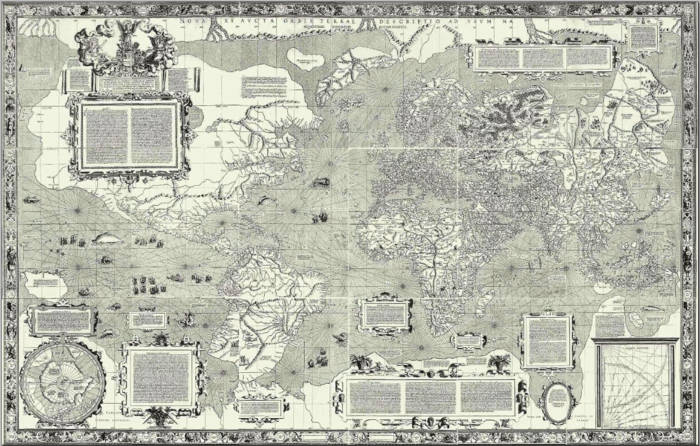
Used as a standard representation of two-dimensional projection of the Earth until the late 20th century, it would be denounced as inaccurate by critics and replaced by modern, oval-shaped maps.
Evolution in technology, printing, photography, and transportation contributed to more accurate maps, making it easier and cheaper to photograph, print, and distribute.

Hey Siri, Take Me Home
In the world we live in, it’s become harder to picture yourself using a folded paper map to guide you through a city, a museum, or tracing a route over it to reach your destination.
The evolution of smartphones and the increasing sophistication of GPS technology allowed for an enormous disruption in businesses like transportation and distribution (and an overall digitization of information, processes, and digital transformation).
Map-making nowadays relies on computer software to provide a variety of services like self-location, search for places, business, and products, and calculating distances. Right now, these services are provided by big enterprises that offer these features to the worldwide public. But, as important as digital maps have become, they still serve the same purpose as the drawn maps that were created centuries before.
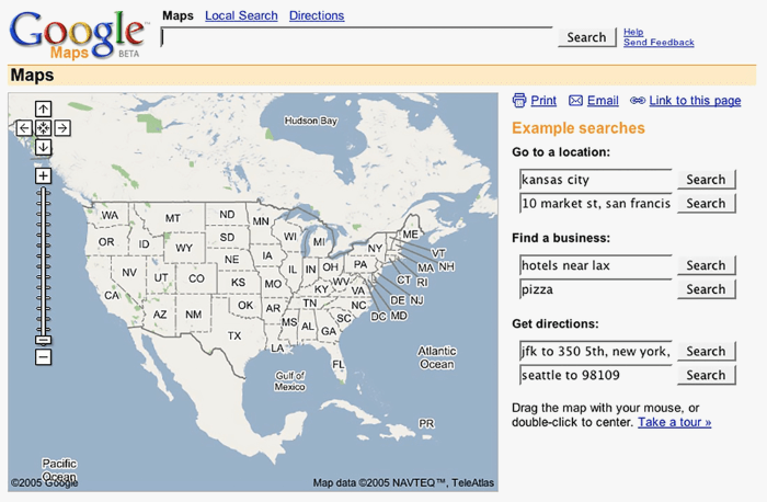
Back in 2005, Google launched Google Maps, and it transformed the way we get information about places. Google made it friendlier for developers to incorporate maps into their projects, websites, and applications through its APIs, enabling a growing suite of location-based applications to thrive and disrupt markets—Foursquare, Uber, Glovo, Booking.com, and virtually every distribution company.
With OutSystems, it’s easier than ever to incorporate a map into your application, making it the central meridian of your business. Leveraging years of map representation, printing, distribution, and technology evolution, the recently launched OutSystems Maps component, based on Google Maps API, lets you represent single or multiple locations on a map with the speed and agility of the platform.
Find OutSystems Maps here.